1. Alyssa Schukar
2. Stories
3. - needed more distance or zoom/all same distance
-too negative theme without enough substance
- themes to common and overdone
4. -Haiti photos had interesting color background
- fallen girl was real and not posed with good choice of competitors legs passing
5. I didn't like the photographer because all pictures were very all over the place without a common theme and were no zoomed enough and too posed and fake.
1. Jordan Murph
2. Sports
3. -expand on rule of thirds: don't repeat techniques: too 'postcard'
- no surfer in surfing picture along with photos that were unnecessary or don't belong
- as the portfolio continued, it started going downhill and didn't remain consistent
4. -great lighting composition
-good work with color and graphics
5. I liked this photographer. I think they did a great job of capturing the victories and downfalls of sports while for the most part maintaining a steady light composition and interesting content.
1. Justin Mott
2. Stories
3. -have a better focused subject of photos
-some confusing and irrelevant pictures
-needs a better selective story focus
4. -shocking and different stories that make you stare and almost disturb you
-good color and graphic work
A. The strengths of the winner that the judges liked were how the portfolio was put together nicely with no blanks, no weak photos, and a consistent technical and creative process. In all the pictures, the subjects had clear reactions or actions, the photographer was so close in the process, he seemed like one of the players in the game or activity, and included interesting shapes that were interesting to the eye.
B. What I liked about the photographer was that it had a very innovative point of view where pictures were taken from aerial or underneath, and gave you a new fresh insight to the same sport of action other photographers continually capture. The photos have a good emotion that is self explanatory and obvious, and the photographer had good editing skills that added to the photo's integrity, and didn't subtract from it.
C. Narrowing down to the winner came with being very harsh on projects they had originally loved. All judges had to observe each photo individually, as well as a portfolio as a whole, and consider it from there.
1. I agree with the judges on the photo with the badminton player, and having the 'ball' suspended over his eye. It has an incredible point of view and viewpoint, and the green background of the tennis court is a solid and non distracting background to the picture.
2. I disagree with the judges on the picture of the baseball stands with the man selling cotton candy. It was entered in the 'No Ball' category and I think it captures the excitement and classic experiencing of being in the stands instead of just being on the field. It used leading lines with the bleachers, as well as color and graphics with the cotton candy, and a viewpoint, when you can't see the man's head, but the cotton candy.
Tuesday, April 4, 2017


Friday, March 24, 2017
Architecture Preview #2
Kansas City Public Library
Details:

Light:

Patterns:

Angles and Shapes:

Surroundings:

Habitat 67
Details:

Light:

Patterns:

Angles and Shapes:

Surroundings:

National Centre for Performing Arts
Details:

Light:

Patterns:

Angles and Shapes:

Surroundings:

Guggenheim Museum
Details:

Light:

Patterns:

Angles and Shapes:

Surroundings:

The Crooked House
Details:

Light:

Patterns:

Angles and Shapes:

Surroundings:

Details:

Light:

Patterns:

Angles and Shapes:

Surroundings:

Habitat 67
Details:

Light:

Patterns:

Angles and Shapes:

Surroundings:

National Centre for Performing Arts
Details:

Light:

Patterns:

Angles and Shapes:

Surroundings:

Guggenheim Museum
Details:

Light:

Patterns:

Angles and Shapes:

Surroundings:

The Crooked House
Details:

Light:

Patterns:

Angles and Shapes:

Surroundings:

Thursday, March 23, 2017
Architecture Preview #1

1. Who is the architect?
William Rockhill Nelson
2. When was it built?
The new update was finished and reopened in 2004.
3. Where is it located?
546 Main; Kansas City
4. Is it a private building or can you visit it?
It's a public library that is open to go and check out books from.
5. Is there information on how much it cost to build?
The new update costed an estimated $50 million.
6. Is there a reason the building was created or the history of the building itself?
The building of the public library became an evolutionary moment for Kansas City's transformation from a small town, to a bustling metropolitan area.
7. Why did you pick this building?
I picked this building because I've always had a soft spot for libraries. Reading books has been and always will be a huge part of my childhood and my comfort in reading stories and transporting myself to new adventures and worlds. One of my favorite quotes, "No two persons ever read the same book." I love going to libraries because everyone there has a genuine love for literature and being surrounded by other people who respect books is something that makes me want to read more. When I saw the architecture, it immediately made me want to fly to Kansas and sit in the library for hours with a good book. The whimsical and playful front of the library creates a sense of magic and humor, something a good book is filled with.

1. Who is the architect?
Moshe Safdie
2. When was it built?
1967
3. Where is it located?
2600 Avenue Pierre-Dupuy next to St. Lawrence River.
4. Is it a private building or can you visit it?
You can't visit and go inside Habitat 67, but it's more of a location to pass by and look at.
5. Is there information on how much it cost to build?
Habitat 67 cost $22,195,920 total to build, which is approximately $140,000 per unit.
6. Is there a reason the building was created or the history of the building itself?
Safdie was inspired to create a blend of modern amenities with a lush touch of gardens, terraces, and view, but still keep the urban vibe of having a short commute downtown, and an apartment format.
7. Why did you pick this building?
I picked this building because I was at first drawn to the name with sounded alienish and modern, as well as urban and funky. When I saw the building I was intrigued on what it was exactly, and what kind of vision the architect had for the project. When I saw the building, it reminded my of the style poor parts of Brazil and Asia look like, for example in Rio, and I wondered how I compared in safety, and how it stood strong while stacked above each other.

1. Who is the architect?
Paul Andreu
2. When was it built?
December 2001-2007
3. Where is it located?
Beijing, China
4. Is it a private building or can you visit it?
The building is an opera house and theater, so as long as you're seeing a show or concert, it's a public building.
5. Is there information on how much it cost to build?
3.2 billion yuan
6. Is there a reason the building was created or the history of the building itself?
The theater was designed so uniquely to be an iconic shape and building, something that viewers would immediately recognize.
7. Why did you pick this building?
This was the first building I picked because being a dancer, I have a special passion for theaters and the glamorous way they make you feel when performing or watching pieces on the stage. The red and gold is a classic and lush way that makes you experience the theater in full luxury, which is included on the interior of the theater. When seeing the building, it reminded me of the Chicago Bean, but with the manmade lake glamorously surrounding the glittering titanium, it's an unforgettable model.

1. Who is the architect?
Frank Gehry
2. When was it built?
Inaugurated October 1997
3. Where is it located?
Abando, Bilbao, Spain
4. Is it a private building or can you visit it?
A museum filled with contemporary art, it's open to the public to view and enjoy.
5. Is there information on how much it cost to build?
$89 million
6. Is there a reason the building was created or the history of the building itself?
The curves and random shapes of the exterior of the museum was designed to catch the light of the sun and play with color and illusion.
7. Why did you pick this building?
I loved the way the building almost looked abandoned from the outside. The gray and rustic color gave it a factory illusion, and a grunge texture that makes it industrial and makes you guess what the building contains, without the smallest suspicion that it's a museum.
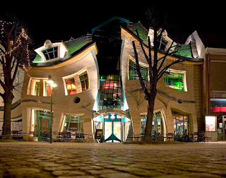
1. Who is the architect?
Szotyńscy & Zaleski
2. When was it built?
2004
3. Where is it located?
Sopot, Poland
4. Is it a private building or can you visit it?
Can be entered from Monte Cassino and Morska streets.
5. Is there information on how much it cost to build?
None
6. Is there a reason the building was created or the history of the building itself?
The building was inspired by the animated illustrations from children's book author's Jan Marcin Szancer and Per Dahlberg.
7. Why did you pick this building?
The name 'The Crooked House' sounds like something from American Horror Story more than a children's book, but when I saw the misshapen and crooked windows, it gave an illusion of bad photoshop and wavering shapes. The fact that when you look at this picture it makes your head spin is something worth applauding.
Sensory Overload/ and Sports Action Assignment
Warm Up
1. I agree with the statement that defining our environments doesn't come directly from the spaces of the environments themselves. This makes me think directly to my photography and the impact of what fills up the space instead of the space itself.
2. I would definitely want to visit and photograph the incredible color and vibrant personality and character of the spaces with the unique items they possess.
3. I would imagine being a child of one of the owners of these unique shops would involve a lot of work, and helping out with making, organizing, or running the shops they own.
4. My favorite picture is the one of the woman in her shop of fake flowers, completely enveloped in the color and blossoms of the different colors and construction of the different shapes.


Thursday, March 9, 2017
Tuesday, March 7, 2017

Subscribe to:
Posts (Atom)