Tuesday, November 29, 2016

100 Most Famous Photos

Starving Child and Vulture

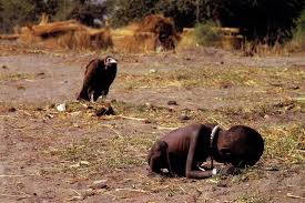
1. I picked this image because at first I mistook the child for a vulture or animal. With his ribs protruding and in a crouched and foetal position, it mirrors the bird behind him. 
2. Photographer Kevin Carter has known, seen, and experienced death. While in Africa he discovered a collapsed child who had crumbled in exhaustion on the way to the feeding center. Photographers are supposed to only observe and capture, so instead of helping the boy, he watched and captured as a vulture landed behind him. 
3. I was unaware that photographers aren't supposed to touch or help subjects they are photographing in Africa, due to disease, and Carter's interaction spiked an interest and debate in the situations in which photographers should intervene. 
4.


5. Kevin Carter
1960-1994
Johannesburg, South Africa 
Military 

Michael Jordan 

1. This image is really interesting to me because of the power it has behind it. The silhouette is really interesting as well. 
2. Co Rentmeester is the photographer. This pose became an iconic symbol that was incorporated in rooms, clothing, and shoes all across the nation. 
3. Being a teenager, I've heard of Jordan shoes and recognize the symbol, but I didn't know that it was an actual picture of Michael Jordan mid leap. 
4. 
 

5. Co Rentmeester
Born in 1936
Amsterdam, Netherlands
Art Center College in Los Angeles

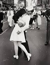
V-J Day in Times Square 

1. This is such a famous picture that I've seen multiple times, and I wanted to understand more about the initial event and the man and women in the photograph.
2. Alfred Eisenstaedt was the photographer who captured the picture after World War ll ended and people filled the streets. Alfred caught this moment of joy, playfulness, and the relief of the war being over.
3. I didn't know that the man and women didn't know one another. While the man was coming back from being overseas, the woman, who was just a nurse, had never met him, and he swooped her in for a kiss. Some people of the modern day argue that it could have been sexual assault, while others differ in saying that everyone was happy and it was a carefree, spurr of the moment action.
4.


5. Alfred Eisenstaedt
1898-1995
Tczew, Poland
Humboldt University of Berlin

The Hindenburg Disaster
1. I had never seen this picture before, and with the smoke and fire, it reminded me of the 9/11 pictures we had seen a while back, but obviously on a much smaller scale.
2. Back in 1937, zeppelins were a symbol of power, wealth, and luxury, but as people waited and watched for it to land, it burst into flames, smoke rolling out of every crevice, sparks cracking and raining down, it was a devastation, killing 36 people.
3. Led Zeppelin even used the photograph as their first album cover, justifying it by the statement by Jimmy Page, "Dramatic photo, dramatic music, dramatic statement."

4.


5. Sam Shere
1905-1982
Minsk, Belarus
N/A

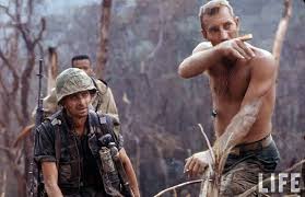
Muhammad Ali V.S Sonny Liston

1. I've always loved Muhammad Ali's drive, confidence, talent, and his inspiration he gave to so many people, so when I saw this photograph, I had to discover more about it.
2.  Sports Illustrated photographer Neil Leifer captured this picture perfectly, Ali was surrounded by an aura of light and smoke, and he seemed bigger and stronger than life.
3. Ali was almost 10 years younger than Liston, and in this match, he knocked Liston down flat only a minute and 44 seconds in. Although many could call Ali cocky and conceited, he backed up everything he said with hard work and action.
4.


5. Neil Leifer
Born in 1942
New York City, New York
N/A


Thursday, November 17, 2016

5 Websites

1. Spiral Staircase

I love this picture because the dainty and delicate detailing in the baister of the staircase. The shaping of the staircase and the birds eye view, it plays with your eyes and makes you want to stare at the picture until you can figure it out. I see point of view as a rule of photography, and without this angle, the picture doesn't stand out or draw your eye. Christian Richter took the photograph. When seeing the picture, it makes me wonder where it was taken and what kind of story the building has. My mom's old house has a spiral staircase she always tells me about, and anytime I see one of these elaborate staircases, it always reminds me of her, and the stories she tells.


2. Great Portraits

When looking at portraits, the subject can sometimes seem stiff, too placed, or boring, and after seeing the same poses, props, angles, and facial expressions, it can seem repetitive, dull, and uninteresting. When incorporating props, and facials that are compelling to look at, it draws your eye and makes you think about what message the photographer is trying to convey. In the photograph above the musician is squinting into the guitar as if trying to see what makes the noise. These portraits are very interesting to look at, and each new person who looks at the picture can interpret it differently, and take away something that relates to them.


3. The Oldest Living Things in the World

The pictures I was drawn to most were the artful pictures of trees that were knocked down, or knotted and buckled roots with branches. These pictures really speak to me because they remind me of the bastrop fires. Trees have always been soothing to me because of the strength and power they hold, but also with grace and wisdom. They have been here much longer than us, and when they are disrespected, cut down, or die, it to me symbolizes a sense of cruelty in human nature, because we're destroying something that does nothing but upkeep our lives and our very lifestyle. This website spoke to me the most out of all the websites because I think not only the pictures are beautiful and extremely well lit, but also spread awareness about nature and the affects humans have on the world.


4. Organizing Chaos in Travel Photography

Travel photography is bursting with color, architecture, style, and personality, but it can sometimes be difficult to take a step back and exam your work with a critiquing eye. Organizing your pictures in a format that makes sense and is appealing to the viewer is important. When elements in the picture are battling for attention, the overall image is scattered and lost and you can't see a clear picture or develop a clear understanding. My favorite tip the website gave was to establish who the hero or protagonist of your picture is. Many people forget that just because it's a still picture, doesn't mean that there isn't a beginning, middle, end, and a protagonist and antagonist. Developing the story and lesson of your picture is important to the understanding and overall impact on the viewer.


5. Photos Every Photographer Should Know How to Make

Learning photography is hard because there's such a balance between technique and artistry. These photos can lend helpful inspiration and help you understand what techniques you need to learn to master to stand out from everyone else. My favorite technique used is the forced perspectives technique. So many ideas can be incorporated and at first glance, the picture plays with a viewers head, and it can make you laugh or even attempt the picture yourself. These types of photography are really popular all over social media and Pinterest, and they lend fun and personality to a photographer's pallet.

Prompt Shoot #3


Tiny


Numbers

Friday, November 11, 2016

Local Austin Photographer

The local Austin photographer I chose is J. Noel Photography. She stands out to me because she covers a variety of themes of photography. She takes beautiful pictures of families, babies, couples, and weddings, and all are captured with beautiful lighting, and a nature background filled with simplicity, and beauty. Her photographs are always taken from a warm and nurturing point of view that makes it seem as if she is extremely close with the subject, and feels a relation to them.

The pictures never seem too placed, and are never stiff, with the people laughing, their eyes closed, and their hair streaming behind them. there is always movement, whether it's the wind, or the subject is running or spinning. All the photographs have a color that is soft, but not overly saturated, and carry a sweet and angelic vibe that is consistent throughout.

I am drawn to these because they seem so content and happy. They carry the essence of fantasy, almost fairy like. Another thing I love about her and her photography, is how in touch she is with simplicity and the wonder it is just to be alive. A series she has, called natural babyhood, incorporates a neutral palette, with no flashy or elaborate bows, patterns, or onesies, and white sheets, only to focus on the beauty and unexplainable wonder, gift, and blessing, having a child is.


Simplicity would be the rule used here, because the focus is solely on the piercing blue eyes of the baby boy. This photograph is from her natural baby series, which is using a extremely natural and simple background and pallet so that the focus is on the baby. This technique was clearly affective because when looking at the photograph, your eyes go directly to the bright blue eyes of the boy.


The rule being used could be balancing elements, because the tree in the background is balancing with the man and the women. I have been following J. Noel's photography for a while, and the story of this couple is one that is unique and special. When the couple learned that their unborn daughter would only live a few hours, after suffering from severe heart and brain complications, instead of terminating her pregnancy, the couple decided to carry to term, and have the baby, and were able to hold her before she passed away. I think the joy of pregnancy is wonderfully captured in the picture, and tells the story very well.


This picture is a perfect example of balance, as the mom and dad are perfectly centered around the boy. This picture is very cute, and captures the silliness and fun of spending time with your family.


This photograph uses rule of thirds, because the little boy and girl are moved slightly to the left of the center of the photograph.


This picture uses symmetry because in the background the square pillows are stacked evenly, creating an even and eye pleasing shape.

Mural Project


The theme of my mural project is Austin, from downtown, to soho, and all the historic and interesting parts of our city that we all know and love, we wanted to showcase why we love our beautiful city so much, and how it's different from any other place in the world. My 9 images focused on the downtown, soco, and trendy portion of Austin, with all the fun artwork, stores, restaurant and the quirks and activities that are Austin.

1. ACL hat

2. Before I Die wall

3. Boots store

4. HEB mural

5. Hey Cupcake

6. Home Slice

7. ILYSM wall

8.  Smile wall

9. Telephone Pole

Tuesday, November 8, 2016

Magazines Part ||


Image based magazine covers are based on drawing the consumer in with a glamorous shot of someone the viewer can identify and relate with. A picture of Kendall Jenner would draw in a younger audience, maybe ages 15-25, while a cover of Willie Nelson would draw in an older audience who have knowledge or can relate to the cover. In the earlier days of magazine covers, the only covers available were illustrations. When magazines use illustrations as their covers, it gives the cover a vintage or classic vibe that is interesting to look at. When an illustration is used, it usually makes a reference to something historical, or an impactful event we all identify with. Type based magazine covers draw the reader in with over exaggerated text, large graphics, and big lettering that draws the eye in to read the text. Concept based magazines give the reader an idea what the entire magazine will explain, design, and illustrate for the reader. Whether it's fashion, food, or fall, the consumer understands what the magazine will encompass, and what they can expect from reading it.

Words and pictures on magazine covers need to balance one another out. If you have an extremely bold picture with bold and graphic writing, incorporating as many techniques and tricks as you can possibly cram into the picture, the picture gets lost, and becomes muddy and unorganized, therefore becoming unappealing to the consumer. On the other end, if you have a simple and basic picture with little or no writing or explanation, there is no appeal, and the reader feels no desire to purchase the magazine because there is no visual stimulus to interest them. A cover needs to be interesting but not overwhelming, simple but not boring, and colorful but not obnoxious, and you will have the perfect balance for a great cover photo.

Favorite Cover


This magazine cover is my favorite because of the stand out white that drew my eye. This cover looks pure and clean on a shelf with other cluttered magazines, muddy with words and too much going on. Gwyneth's skin is glowing and clear, and the netting over her face is mysterious and elegant with her blue eyes glowing from behind the veil. Some critiques that would improve the magazine cover even more would be if the exposure of the camera was lowered slightly. The background is white, the veil is white, and Gwyneth is also pale, so the intense exposure and lighting makes the shot bright and stark, and if it were lowered slightly, it wouldn't wash out her face. Having the magazine cover title in a bold black with a thick and elaborate font, wouldn't have been my choice either. The font draws you attention away from her glowy and angelic face, which should be the main focus of the cover. Having a bold black cover title that covers up her hair and parts of the beautifully designed cap/crown could've been better placed under her chin, and completely removed from her face completely. Despite these slight improvements, the shot is beautifully shot with an angelic and timeless vibe that draws the eye and makes you wonder what's in the pages.

Best Covers

1. Formal
2. Casual
3. Environmental
4. Environmental
5.Environmental
6. Formal
7. Environmental
8. Casual
9. Formal
10. Formal
11. Formal
12. Formal
13. Casual
14. Formal
15. Formal
16. Environmental
17. Casual

Magazine Tips


1. Bold Color

2. Overwhelm of color, text and pictures

3. Don't judge the cover by what's on the computer

4. Decide what element should be the most dominant

5. Less is more sometimes

Tuesday, November 1, 2016

American Soldier

American Soldier

A. I think the most powerful image is the one of the soldiers stringing up Christmas lights. I guess I never really understood the amount of holidays, moments, and events people in the army don't get to experience. Being able to see them putting up the lights amidst the cots and makeshift holiday decor is really powerful and makes the appreciative that I get to spend the holidays with my family.

B. The images all evolve and change with the positives and negatives of Fisher's story. They make you feel like you're the photographer and you can understand a soldier's journey as best as anyone can without actually being one.

C. The captions are so well done and descriptive that they enhance the picture by making sure that the viewer fully comprehends the picture with some background information. From all the captions being so close the Ian, I feel like I can understand what he's going through.

D. Ian joins the army at the young age of 17, and is sent to train, leaving behind his family, his friends, and his girlfriend. Fisher endures the 'red zone' period of training, filled with extreme training, intense commands, all paired with little to no sleep. Ian goes through a rough patch with drugs, girls, and even gets lowered a rank. Once it's time for his one year deployment to Iraq, Ian feels like he's finally making a positive impact. He fights long and hard, understanding the meaning of war, and the loneliness of deployment. When Ian comes home, he marries his girlfriend Devin, and feels a sense of accomplishment and pride for everything he's overcome.

E. When Ian is the main subject of the picture, the caption is usually written in present tense.

F.

1. The captions are usually about 2-5 sentences.

2. In the first few sentences, it explains the subject and action of the picture.

3. In the second sentences, it provides background information and an explanation for what is happening.

4. If there is a third sentence, it provides why the subject may be doing what it's doing and an emotional connection.

5. Yes, many captions include quotes.

6. Yes, depending on how much explanation the picture needed, the caption could extend up to 5 sentences.

G. Because if the photos are done well enough, they can tell as story on their own through facial expression, body language, lighting, and point of view. So the captions are actually just short explanations, and aren't necessarily needed.

H. A story can help a reader imagine for themselves how situations or subjects react to events.