Friday, September 30, 2016
Great Black and White Photographers Part2
Klein
The black and white photographer i chose is William Klein. William was born April 19th, 1928, and is an American born- French photographer. He is now 88 years old, and his career was focused on street photography, showing true, raw pictures with a story and a meaning as well as fashion that made statements. Klein was born in New York City and was raised by a Jewish family. As a young teenager he graduated from high school early and enrolled in the City College of New York at only 14.
Klein became very successful after entering pieces in the Milan and later witnessed widespread fame after becoming Vogue's fashion photographer. In his younger years, Klein wanted to be an artist or work more in sculpting, s when he won the Prix Nadar in 1957 for New York with little to no photography training, it was a huge deal. William then went on to create fashion films about models, and photography and art all in one.
Klein is now 88, and still influences the fashion and photography industry immensely. In his time, Klein rebelled against classic street photography and used blur, grain, and shading to his advantage instead of trying to perfect a clean and sterile image. He tells stories throughout all of his art and has lead many more designers, artists, and photographers in his path.
Peer Reflection
https://cadensbloog.blogspot.com/
Positives:
1. He did a great job of going to different locations and finding rules that fit the pictures well.
2. All the pictures are in good focus and are sharp and clear to the eye.
Critiques:
1. On the rule of thirds photo, it could have been improved by more of a flat angle because the 2 guys in the photo pull focus from each other slightly.
2. In the photo for simplicity if he had gotten slightly closer and just has the picture of the gu and his notebook it would have been a better representation of simplicity.
Academic Shoot Reflection and Critique
Academic Shoot Reflection and Critique
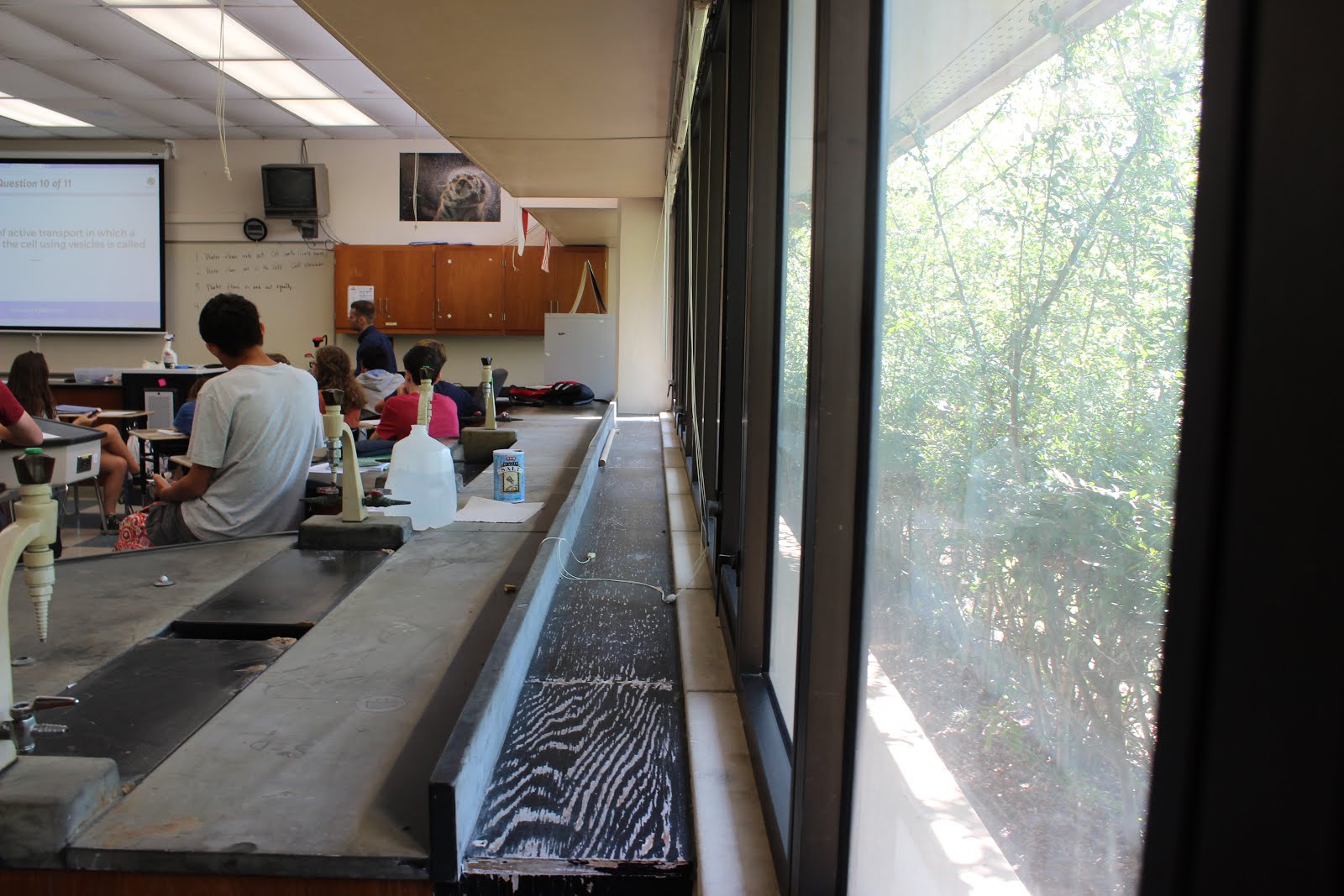
1. Some challenges I faced while taking the prompted pictures was that in a classroom there's so much supplies, posters, people, and clutter so it was hard to find a clear subject and focus.
2. I found myself thinking most about the focus of the pictures. I noticed this especially when taking pictures closer up. Even though we hadn't yet learned about aperture I was using in it my pictures to make the subject clearer than the background. This is especially apparent in the photo of the girl I used for simplicity.
3. If I could do the assignment over again, I would try to think about the photography rules as I was taking the picture and try to find the perfect example for each rule than forcing them when it didn't work in the post shoot reflection.
4. I would keep my same train of thought when it came to the photos because I think my ideas were good, just the execution could have been better.
5. The rule that will be easiest for me to achieve will probably be simplicity since it's just an up close and focused picture, eliminating distractions and unnecessary clutter.
6. Rule of thirds will probably be the hardest rule for me to shoot because you have to have the focal point in a certain slot of the photo and make sure that it's the clear subject and not competing with any other object for attention.
7. The rule I understand but is hard to find when you yourself are shooting, is rule of avoiding mergers. This rule can be difficult to find because only some situations work for the rule.
Tuesday, September 27, 2016
ISO, Aperture, and Shutter Speed
1. We should relate aperture to the pupil of the eye, the larger the pupil the more light that enters.
2. The smaller the aperture number, the bigger the aperture size.
3. When you use a smaller aperture, such as a f/32, it brings the background of the picture into almost as much clarity and crispness as the focus of the photograph. When using a bigger aperture, such as an f/2, the focus of the photograph is sharp and clean, while the background of the photo appears blurred and clouded, allowing the focus to be on the subject.

This photo was taken at an aperture of f/2. I know this because the flower is in much more focus than the background of other leaves and flowers.

This photo was taken at an aperture of f/25 or so because the bouquet is in just as much focus as the bride and her dress.
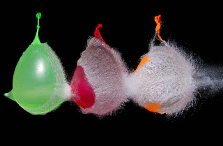
This picture was taken at a high shutter speed because the water balloons are in mid burst and you had to capture it at the perfect moment.

This picture was taken at a low shutter speed because the dancers are twirling around, and instead of capturing them clearly mid twirl, it must have been taken with a low shutter speed.
Shutter Speed at Bulldogs and Hotdogs
high shutter speed example: 1/2000 (Bird photography)
low shutter speed example: 1/30 (Motion photography)
Bright Lighting
a. depending on the business of the booth, I would most likely use a fast shutter speed, which means keeping the image clear and sharp, because there is most likely many people moving around.
b. at a food booth I would again want to use a fast shutter speed because of the movement, and making the expressions and actions clear.
c. for the dancers moving I would want to use a high shutter speed to capture all of the kicks, movement, arms, and intricacy that is executed.
d. if I wanted to capture the movement of the kids dancing, I could use a slow shutter speed to show through the photo the movement.
e. if I wanted to show the movement of the people arriving through the doors, I could use a slow shutter speed to give the picture dynamic.
f. I would want to use a fast shutter speed pf the basketball hoops to show the freeze pictures of the ball midair.
Dark Lighting
a. since the lighting has now shifted and become dark, I would want to use a slower shutter speed, maybe on a tripod near the booths to capture the pictures.
b. at a food booth with things being prepared and handed out, I would still want to use a fast shutter speed to capture the actions. I don't think it would be clear if it was slightly blurred.
c. even though it's darker outside, now that we're inside the gym, I have better lighting. I would still want to use the fast shutter speed to capture the movement and choreography.
d. I would use a slow shutter speed of the kids dancing and having fun to show movement. This is different from the Silver Stars because the preciseness and timing doesn't matter like it does in a routine.
e. I would use a slow shutter speed to show the people streaming through the doors and their movement.
f. I would still use a fast shutter speed on the basketball hoops because having the action with the ball midair is important to have clear and sharp.
ISO
1. It would be helpful to use a high ISO at a game because of the high speed action that you're trying to capture.
2. The author suggested that a low ISO would be best suited for an image with good base lighting, and can be lowest possible without adding blur or noise to the picture.
3. The author advised that a high ISO works best for high speed and section shots when you don't have enough time or light to capture the image with a low ISO.
DSLR Camera
1. Aperture settings:
2.8, 4, 5.6, 8, 11, 16, 22
2. Shutter Speed settings:
1 second, 1/60th, 1/4000
3. ISO settings:
10, 200, 400, 800, 1600, 3200, 6400, 12800, 25600
2. The smaller the aperture number, the bigger the aperture size.
3. When you use a smaller aperture, such as a f/32, it brings the background of the picture into almost as much clarity and crispness as the focus of the photograph. When using a bigger aperture, such as an f/2, the focus of the photograph is sharp and clean, while the background of the photo appears blurred and clouded, allowing the focus to be on the subject.
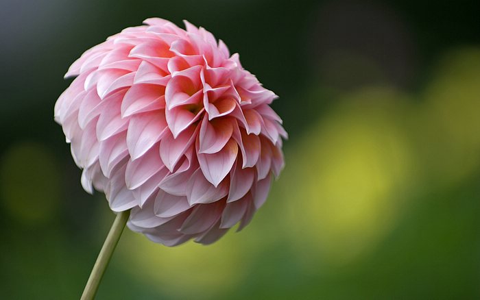
This photo was taken at an aperture of f/2. I know this because the flower is in much more focus than the background of other leaves and flowers.

This photo was taken at an aperture of f/25 or so because the bouquet is in just as much focus as the bride and her dress.

This picture was taken at a high shutter speed because the water balloons are in mid burst and you had to capture it at the perfect moment.

This picture was taken at a low shutter speed because the dancers are twirling around, and instead of capturing them clearly mid twirl, it must have been taken with a low shutter speed.
Shutter Speed at Bulldogs and Hotdogs
high shutter speed example: 1/2000 (Bird photography)
low shutter speed example: 1/30 (Motion photography)
Bright Lighting
a. depending on the business of the booth, I would most likely use a fast shutter speed, which means keeping the image clear and sharp, because there is most likely many people moving around.
b. at a food booth I would again want to use a fast shutter speed because of the movement, and making the expressions and actions clear.
c. for the dancers moving I would want to use a high shutter speed to capture all of the kicks, movement, arms, and intricacy that is executed.
d. if I wanted to capture the movement of the kids dancing, I could use a slow shutter speed to show through the photo the movement.
e. if I wanted to show the movement of the people arriving through the doors, I could use a slow shutter speed to give the picture dynamic.
f. I would want to use a fast shutter speed pf the basketball hoops to show the freeze pictures of the ball midair.
Dark Lighting
a. since the lighting has now shifted and become dark, I would want to use a slower shutter speed, maybe on a tripod near the booths to capture the pictures.
b. at a food booth with things being prepared and handed out, I would still want to use a fast shutter speed to capture the actions. I don't think it would be clear if it was slightly blurred.
c. even though it's darker outside, now that we're inside the gym, I have better lighting. I would still want to use the fast shutter speed to capture the movement and choreography.
d. I would use a slow shutter speed of the kids dancing and having fun to show movement. This is different from the Silver Stars because the preciseness and timing doesn't matter like it does in a routine.
e. I would use a slow shutter speed to show the people streaming through the doors and their movement.
f. I would still use a fast shutter speed on the basketball hoops because having the action with the ball midair is important to have clear and sharp.
ISO
1. It would be helpful to use a high ISO at a game because of the high speed action that you're trying to capture.
2. The author suggested that a low ISO would be best suited for an image with good base lighting, and can be lowest possible without adding blur or noise to the picture.
3. The author advised that a high ISO works best for high speed and section shots when you don't have enough time or light to capture the image with a low ISO.
DSLR Camera
1. Aperture settings:
2.8, 4, 5.6, 8, 11, 16, 22
2. Shutter Speed settings:
1 second, 1/60th, 1/4000
3. ISO settings:
10, 200, 400, 800, 1600, 3200, 6400, 12800, 25600
Thursday, September 22, 2016
Photo Manipulation and Ethics
Photo Manipulation & Ethics
A. Some of the main points I read about in the article are about the fine line between documenting the truth, and making your work look its best and make the most sense.
B. Washington post and new York times require all journalists to turn in their proofs and original shots.
C. Personally, I think acceptable edits would be enhancing the color or clarity of an image, or highlighting and whitening a picture.
D.

The picture that I think is the most unethical is the University of Wisconsin picture on their pamphlet. Instead of showcasing the real diversity, or maybe lack there of, they photoshopped a picture of a black male into the crowd, to make it seem like their campus was more diverse. Instead of faking and photoshopping, maybe they should work on expanding their body of students and the various races, religions, and people they should have.
E.

I think the manipulation that is the least unethical is the picture of Kenny and Bobby McCaughey on the cover of Newsweek, after they were blessed with septuplets. Though some people may think that them trying to change the way she looks is the worst form on manipulation, my personal opinion is that the change wasn't extremely dramatic, it wasn't of her body or her face, and only of her teeth. If it were me personally, I would want my teeth, to look nice on a close up of me on a public magazine.
A. Some of the main points I read about in the article are about the fine line between documenting the truth, and making your work look its best and make the most sense.
B. Washington post and new York times require all journalists to turn in their proofs and original shots.
C. Personally, I think acceptable edits would be enhancing the color or clarity of an image, or highlighting and whitening a picture.
D.
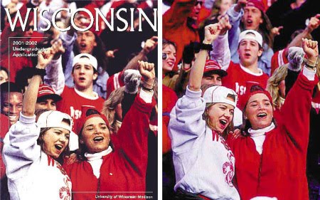
The picture that I think is the most unethical is the University of Wisconsin picture on their pamphlet. Instead of showcasing the real diversity, or maybe lack there of, they photoshopped a picture of a black male into the crowd, to make it seem like their campus was more diverse. Instead of faking and photoshopping, maybe they should work on expanding their body of students and the various races, religions, and people they should have.
E.

I think the manipulation that is the least unethical is the picture of Kenny and Bobby McCaughey on the cover of Newsweek, after they were blessed with septuplets. Though some people may think that them trying to change the way she looks is the worst form on manipulation, my personal opinion is that the change wasn't extremely dramatic, it wasn't of her body or her face, and only of her teeth. If it were me personally, I would want my teeth, to look nice on a close up of me on a public magazine.
Academic Shoot

Rule: Avoiding Mergers because when I tried to take the picture from behind, the phone was going through her head.
Subject: Phone
Is it clear? Yes because the focus is directly on the phone and the bright colors draw your eye.
Rule: This could have been a better example of balance if I had the line of the window be centered in the middle of the photograph.
Subject: Outside
Is it clear? No the subject is not clear because the photo is cluttered and uncentered.

Rule: Framing
Subject: Teacher and Flag
Is it clear? Yes the focus is clear because the only part of the photo that is visible is the woman and the flag which draws your eye.
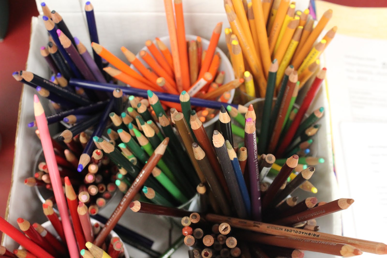
Rule: I think the adjacent lines of the colored pencils gives the picture the rule of lines, but it definitely could have been improved if they were pointing to a focal point.
Subject: Color
Is it clear? No the subject is not clear and is more abstract without a clear focal point.

Rule: Rule of Thirds because when you first look the computer in the upper left screen is the focal point and the three kids are on the right side.
Subject: Laptop
Is it clear: In the aspect of rule of thirds it draws your eye to the top left but the picture is also cluttered so the subject of the picture isn't perfectly clear.

Rule: Simplicity
Subject: Girl's face
Is it clear? Yes the subject is clear because it's directly focused on the girls face like a portrait style.
Friday, September 16, 2016
Academic Shoot Preview

The Story:
I think this photograph tells the best story because it shows people hands on helping out. It shoes the expressions, the food they're serving, and everything is very raw and apparent in the picture. You can see the man in the back, the attire of the homeless, and the work that's going in to help better lives. The whole picture tells a story, and you can understand what's happening just by looking at it.
Action and Emotion:
I think this picture shows the best emotion because everyone is gathered around the pole, holding hands. While when we may not know exactly what's happening in the photograph, you can feel the emotion and heartfelt feelings radiating from the photograph.
Filling the Frame:
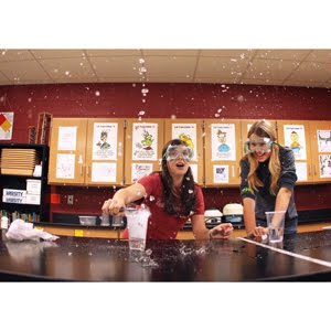
I think this picture has the most action and interesting things in the background. From the water captured suspended in the air, to the expressions of the girls, the classroom supplies in the background, plus trying to figure out what is happening in the picture, this photo captures the essence of what school should be like, exciting, and educational.
Junior Year:
1. Why did you pick this photo?
I picked the photo 'Junior Year' because I think it shows the kind of pressure put on students for the SAT's. The above ground angle adds to the interesting look, since you aren't able to the the students face, only the title of his books, and his position.
2. What rules of photography are evident in this photo?
I think this picture shows the rule of balance most. The geometric shapes of his books create an interesting angle to look at. The black and white gives the photo simplicity, which is another technique being used. His materials, books, and the library shelving are the only things seen in the picture besides him, this gives the photo a calm and simple vibe.
My Pictures:
1. I could take pictures like these in classrooms where there is colorful work up on the wall, an active work ethic happening, and exciting and vibrant teacher, and an environment that is fun and interesting to look at.
2. I could go work in Mr. Rodriguez and Mr. Mayfield's classrooms since both have large and interesting classes, as well as personalities.
3. As a photographer, I will take candid shots, as well as pictures that tell a story, show a personality, a and promote a healthy and education school experience.
Thursday, September 15, 2016
Challenges
1. What challenges did you encounter while trying to get the photos of your first 4 prompts?
2. What technical aspects of photography or the assignment in general (focus, framing, holding the camera, etc.) did you find yourself thinking about the most? Provide a specific example of what you did to do this correctly.
3. If you could do the assignment again, what would you do differently now that you know some basic rules of photography?
4. What things would you do the same?
5. Finally - go back and edit your blogs with the 4 photos, tell me what rules of composition (which you just learned about) did you end up actually achieving? Did you have any?
I learned a lot about lines and rule of threes, I really like the look of having the focal point of centered.
6. Are you interested in shooting those same prompts again, why?
I really enjoyed shooting with a person, because I could position them how I wanted, and get the precise shot.
9/11 Rules

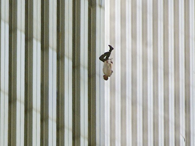
I chose lines for this classification/technique because the falling man is perfectly centered in between the two buildings, and perfectly parallel to the lines on the building. It's calm and clear, and simple to look at. This picture is extremely impactful to me because it captures someone who made an extremely hard decision. This picture stood out to me because compared to all the chaotic and flailing pictures taking at 9/11, this man is strangely calm. He gave the terrorists o power, and took his life into his own hands.
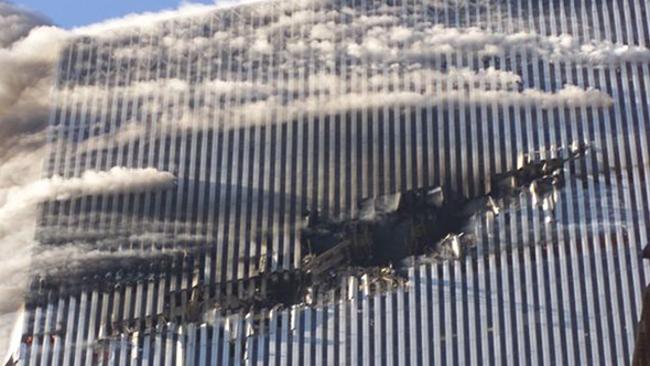
I chose rule for this was rule of thirds. With the huge whole being centered. The billowing smoke also draws attention to the upper section. The huge gaping hole slashing right through the carefully lined and sleek longitudinal lines of the building and drew my eye because it shows the initial and physical damage the plane did.
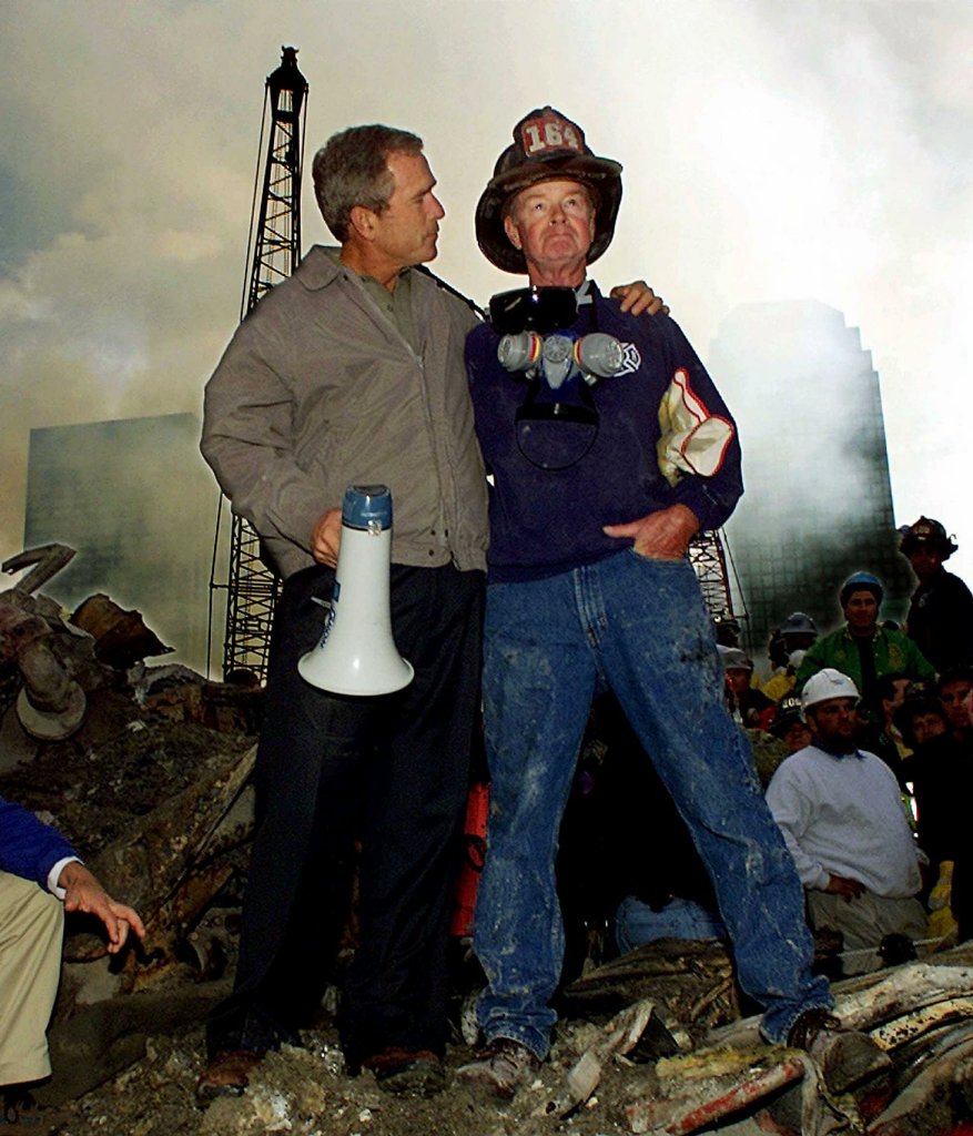
I chose avoiding mergers for this picture because if Bush had moved over just an inch or so, the pole would be pointing directly through his head. This picture gives me a sense of strength and power. The firefighter and Bush stand proudly over all the rubble and ash that caked the ground.

The classification I put this under is framing. The outline of the jagged and shredded walls encase him in a perfect frame. The fireman is climbing the ladder above the destroyed rubble and ash floating in the air. For some reason this picture gives me a sense of peace and serenity, like the calm after the storm.
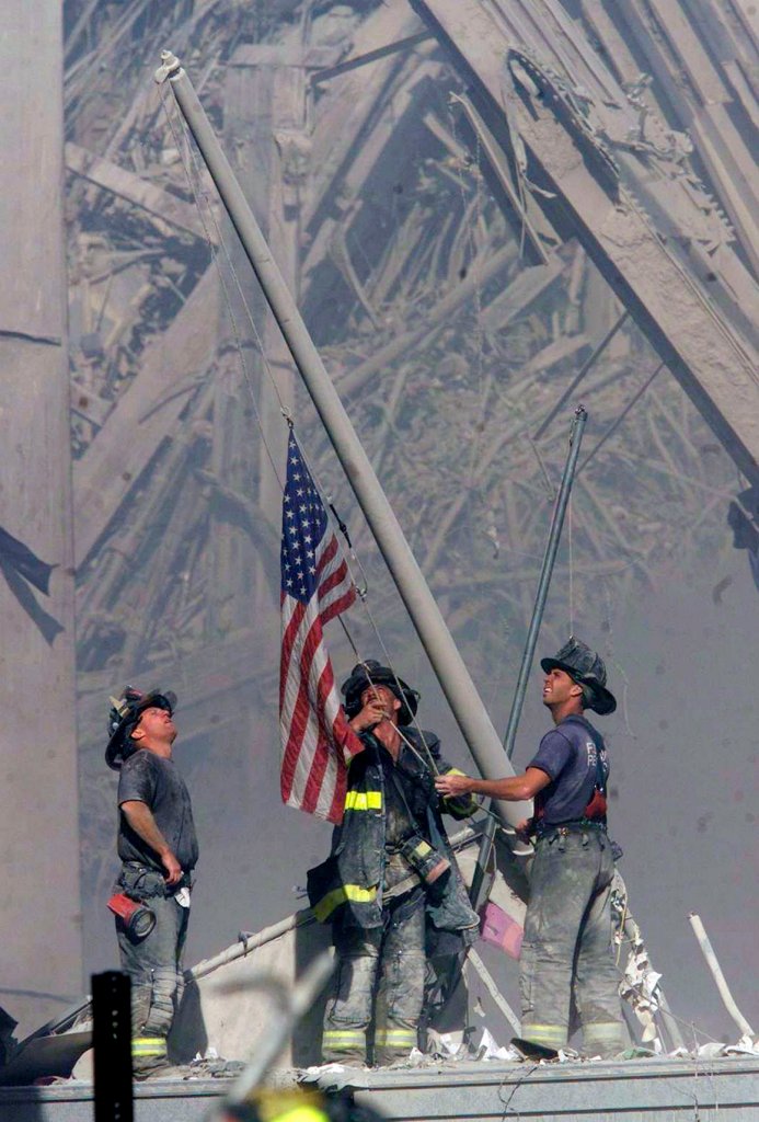
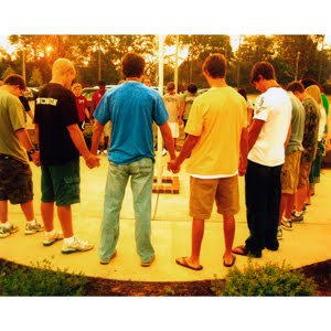
The technique that is being used is balance. The three men standing together in a geometrical shape putting up the American Flag amidst all the chaos. This makes me feel pride and happiness becuase while everyone was going through terror and turmoil we showed strength and power by raising our flag high.

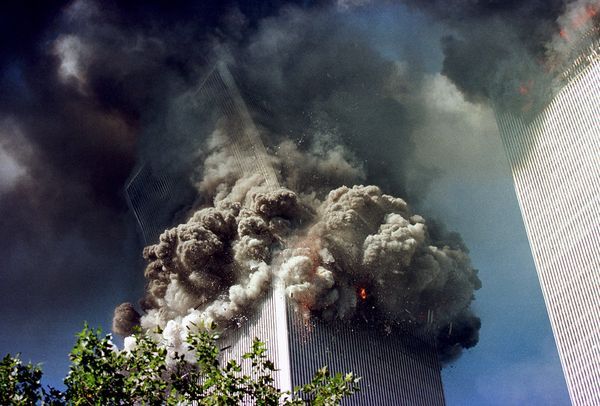
I used simplicity to classify this picture because the entire focus is on the exploding and billowing thick smoke clouding the building. This to me is the most intense picture because looking at it it looks like a video game or movie, extremely inhumane. Looking at this picture it's sickening to imagine the hundreds people inside the building at that very movement.
Tuesday, September 13, 2016
9/11 Reflection
When reading the 9/11 articles about The Falling Man, it made my stomach churn. I wondered how I would feel, trying to identify my family member by a blurry picture of a man mid jump to his death. It saddens me how people turn the photograph into a blame of someone gong to hell, instead of thinking about the disgusting event that forced this all to unfold. Many people lost their lives, and even if they didn't, the weight of the event drags them down. From first responders, to survivors, and witnesses, to even journalists, and people watching on the T.V at home the whole nation was affected. We will never forget.
9/11 Rule Explanations
The technique being used is simplicity. The shot is focused up at the sky without any people, cars, or any distractions.
The technique being used is lines. The lines on the building give the picture dimension.

The technique being used is balance. The 3 firefighters in the formation with the flag in the middle gives the perfect angle.

The technique being used is rule of thirds. The smoke is up in the top left corner while the gaping hole is centered.

The technique being used is framing. The outline of the shredded structure perfectly captures the firefighter in the middle.

The technique being used is avoiding mergers. If the angle had been shifted over slightly, the telephone pole would be going right through Bush's head.
My Favorite Photos
My Favorite Photos:
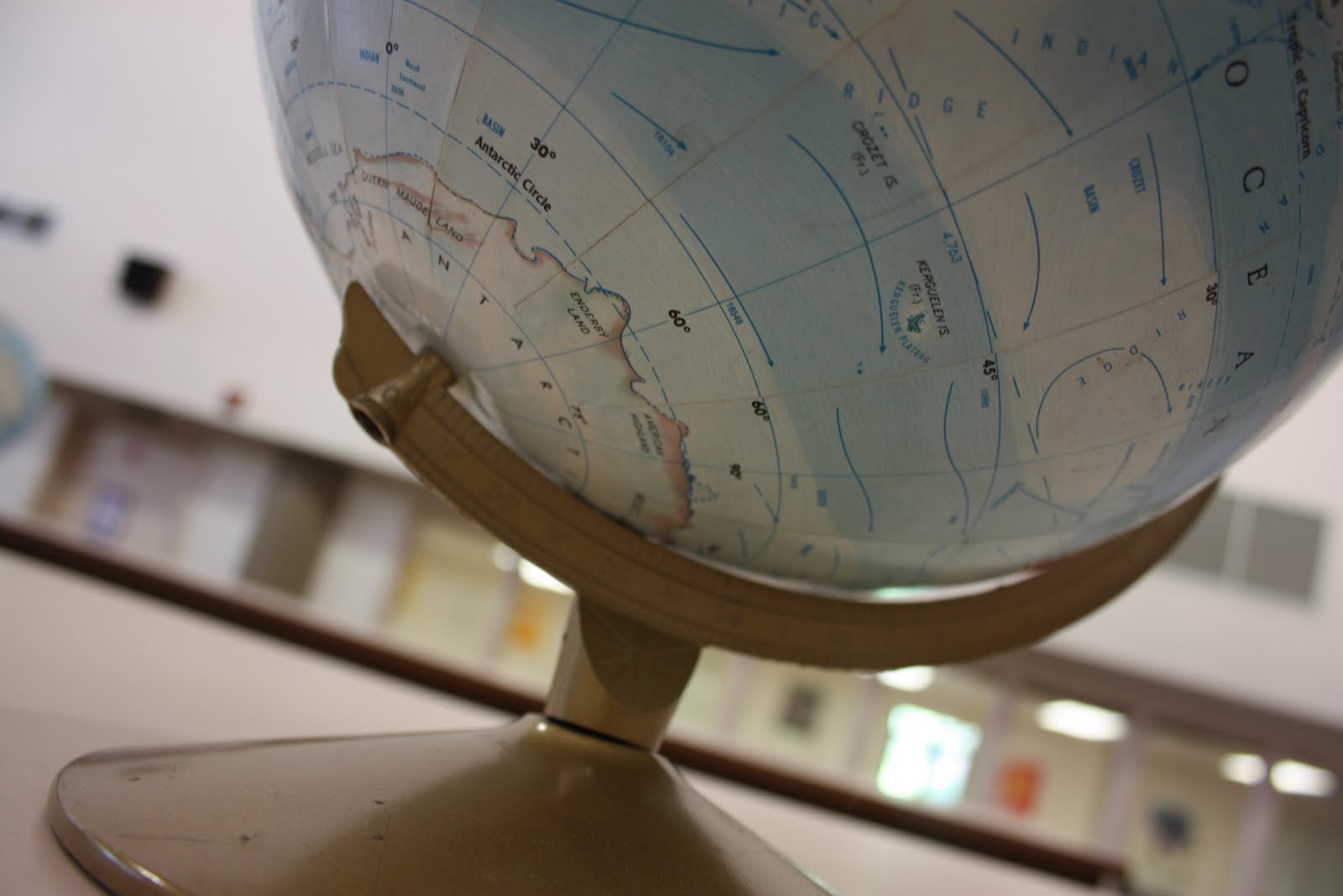
This picture for me uses the technique rule of thirds just because the color of the globe, the focal point, is up at the top, and the base is the centered part.

I could have used the technique framing if I had included the curtains in the shot.
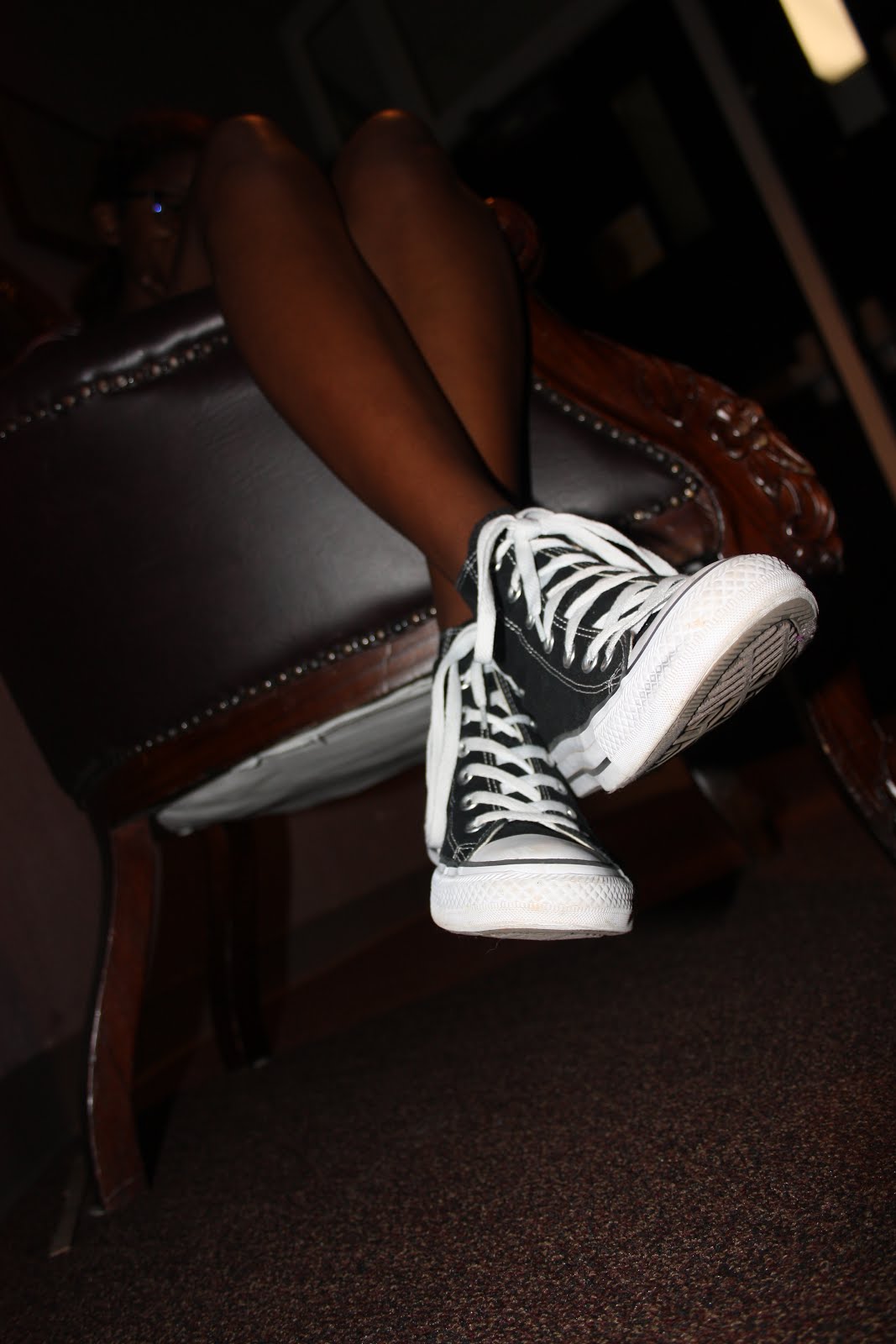
I used the avoiding mergers technique in this photo because I had to shift angles to make sure the chair leg wasn't coming between Natalia's legs.

I think this picture also uses lines because the design in the chair outline, contradicted with the seams in the chair give an interesting aesthetic. I think the slight blur actually added to the affect, but would have also been interesting if clearer.
Thursday, September 8, 2016
Favorite Modern Photographers
Favorite Modern Photographers
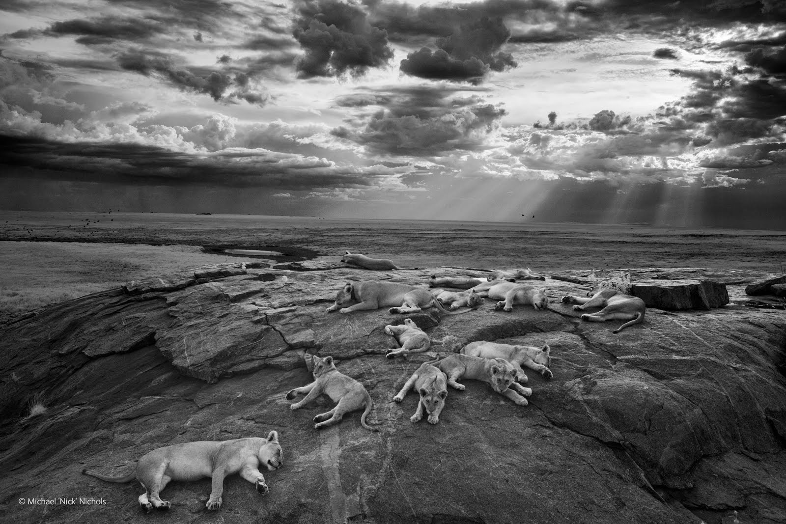
Michael Nichols
National Geographic Photographer
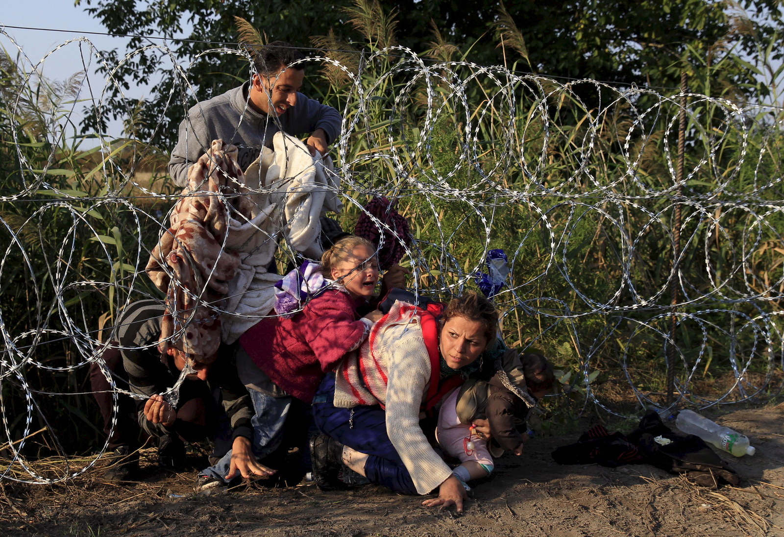
Bernadett Szabo
Syrian Refugees Crossing Border
Shea Glover
Before and After Telling Someone They're Beautiful

The Camera
The Camera: History and Basic Functions
1. Explain the "camera obscura" effect. How is it achieved?
Inside a dark room, a tiny hole is created and a light is shone through, projecting the outside scenery on the opposite wall. This is the first dark room.
2. What invention during the 17th Century helped man get a step closer to creating the modern camera?
Christian Huygens and Issac Newton perfected the creating of high quality lenses and optics.
3. What were the parts of the first modern camera invented by Niepce?
In 1827 Joseph Niepce created the film, the final step to completing the first functioning camera.
4. What do modern digital cameras have in common with Niepce's camera?
Light still passes through the lens, into the camera, and exposes the film, and the final result is still a beautiful photograph.
5. What do digital cameras use to capture an image?
These modern digital cameras use an electronic sensor called a CCD. After that, they are all saved to a computer memory card or system.
6. What is the difference between the auto mode and the program mode?
Auto mode completely controls flash, exposure, and sometimes even auto focus, while program mode is more of a point and shoot camera, and you make the adjustments manually.
7. What is the Portrait mode used for? How does it work?
Portrait mode will blur out any background distractions and focus sharply on the subject.
8. What is sport mode used for? How does it work?
Sports mode is used for capturing an action shot with least blur possible, so the camera will use the highest shutter speed possible.
9. Why should you do a half press on the trigger button?
The half press locks the camera in on the subject, focuses and sharpens, and almost gives you a overview of what the shot will look like. Then when the green dot or beeping noise appears, fire the camera, and your shot should be perfectly clear and crisp.
10. What does this symbol mean? When would you use this?
This symbol represents no flash. You can use this when the flash is simply not necessary, and you'd rather have the natural light to give it more of a dramatic affect.
11. What does this symbol mean? When would you use this?
This symbol means auto flash, and you would use this if the camera automatically thinks that the photo would look better with more light.
12. What happens to your photo if there's too much light?
if there's too much light in a picture, than it will be washed out, unappealing, and boring to the eye.
13. What happens to the photo if there's not enough light?
If there isn't enough light than the photo becomes dark, and you're unable to see and understand what the picture is of.
14. What is a "stop?"
A stop is a universal term used by photographers that describes the amount of light in a picture.
15. How many stops brighter is the new planet if there are 2 suns instead of 1?
If there are 2 suns instead of 1, the light would increase by 1 stop.
16. How many stops brighter is the new planet if there are 4 suns instead of 2.
If there are 4 suns instead of 2, it would be 2 stops brighter.
17. What affect does a longer shutter speed have?
A longer shutter speed has more light.
18. What affect does a shorter shutter speed have?
A shorter shutter speed has less light.
19. What does the aperture control?
The aperture is what the light passes through, it controls the amount of light.
20. When adjusting the aperture, how can you increase the amount of light?
You can adjust the aperture by using the F- Stop. The smaller the F- Stop numbers are, the larger the opening. The larger the opening, the moe the light.
Thursday, September 1, 2016
Favorite Black and White Photographers
My favorite black and white photographers are:
-Madotti-
Hands of a puppeteer:

-Brassai-
Lovers in a Bistro:

-Klien-
Theater Tickets:

Subscribe to:
Posts (Atom)